
Creating a Blazor component is one of the first things we want to do when we create a Blazor application. As we learned in the Blazor introduction, Blazor applications consist of many Blazor components. A Blazor component represents a part of the user interface and can be reused in your application or even in multiple applications.
If you prefer to watch a video instead of reading this detailed article, I don’t judge you.
Subscribe to my channel, if you do not want to miss a video:
A Blazor component consists of an HTML (and CSS) template and C# code that glues the application and the component together.
For the code example in this article, I used the standard Blazor Server application template of Visual Studio 2019 Community Edition. You might want to do the same if you’re going to code along and use the snippets provided below. This code works with .NET Core 3.1.
Blazor Components are Razor Components
When we want to create a Blazor component within Visual Studio 2019 Community Edition, we right-click on the folder we want to create a new component for and click on the add new item menu option.
Within the Add New Item dialog, we click on Visual C# and choose Razor Component as our file template. Fill in a Component name and click on the Add button on the bottom right corner to create the file.
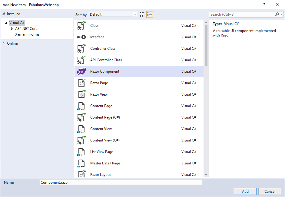
In this article, we’re going to create a ProductCard component.
It’s important to understand that in the context of Blazor, we use Razor components, which means that we build components using the Razor syntax. In the context of this article, we reference our component as a Blazor component, because we use it in a Blazor application.
The structure of a Blazor Component
The selected Razor component template generates a simplistic file in our Solution Explorer.
<h3>Component</h3>
@code {
}
We have two parts. In the upper half of the Blazor component, we have the HTML template. In this case, a single <div> tag with the name of the component represents the component template.
In the lower part of the Blazor component, we have a @code directive, which wraps C# code for our Blazor component. Up to now, there is no C# code within our new Blazor component.
Implementing the Blazor component template
We want to change our Blazor component template to something more useful than only the name of the component.
As I wrote at the start of this article, this component is created within the default Blazor Server app project template generated by Visual Studio 2019 Community Edition.
This project template has Bootstrap included, which we’ll use as a user interface components library for our Blazor component template.
 <div class="product-card">
    <div class="card" style="width: 18rem;">
        <img class="card-img-top" src="@imageUrl" alt="Card image cap">
        <div class="card-body">
            <h5 class="card-title">@productName</h5>
            <p class="card-text">@productDescription</p>
            <a href="" class="btn btn-primary">Add to cart</a>
        </div>
    </div>
</div>
We use the above code snippet as a template for our Blazor component. It will represent a product card, which could possibly be found within an online shop.
Most of the template uses standard HTML tags, including div, img, h5, p, and a. Some of those tags have classes attached to them that are defined in Bootstrap. It allows us to style our template without having to write the CSS ourselves.
How to use Variables in Blazor Components
We need to take a close look at the template where we use @imageUrl, @productName, and @productDescription.
Those definitions are placeholders for variables defined in the C# part of the component. The C# part of the component belongs below the template definition and is wrapped within a @code directive.
@code {
    private string imageUrl =
        "https://dummyimage.com/286x180/8EB1C7/FEFDFF.png&text=Awesome+Product";
    private string productName =
        "Awesome Product";
    private string productDescription =
        "You won't believe how great this product is until you actually use it yourself.";
}
The variables are defined as private string variables. It’s important to understand that those variables are not defined within an explicit class definition, nor are they static.
The variables are part of the Blazor component class deriving from Microsoft.AspNetCore.Components.BaseComponent, but the class definition does not have to be explicitly written. It’s a handy shortcut we use within Blazor Components.
The complete ProductCard Blazor Component looks like this:
<div class="product-card">
    <div class="card" style="width: 18rem;">
        <img class="card-img-top" src="@imageUrl" alt="Card image cap">
        <div class="card-body">
            <h5 class="card-title">@productName</h5>
            <p class="card-text">@productDescription</p>
            <a href="" class="btn btn-primary">Add to cart</a>
        </div>
    </div>
</div>

@code {
    private string imageUrl =
        "https://dummyimage.com/286x180/8EB1C7/FEFDFF.png&text=Awesome+Product";
    private string productName =
        "Awesome Product";
    private string productDescription =
        "You won't believe how great this product is until you actually use it yourself.";
}
How to include a Blazor Component in a Page
Now that we have our first component completed, we want to show it on a page. A page in Blazor is a Blazor Component itself, that also provides the ability to be addressed using a route.
For now, let’s use the default Blazor Server application template and add our created component to the Index.razor page.
@page "/"
@using BlazorApp5.Components

<h1>Welcome!</h1>

<ProductCard></ProductCard>
To include a component within another component, we can use a HTML tag with the name of the component. In our case, <ProductCard></ProductCard> can be used to place our Blazor component within the Index Blazor Component.
If you defined the ProductCard component in another namespace than the Index component, e.g., Components, we need to add a using statement at the top of the Index component. You can see that using statement on line 2 in the code snippet above.
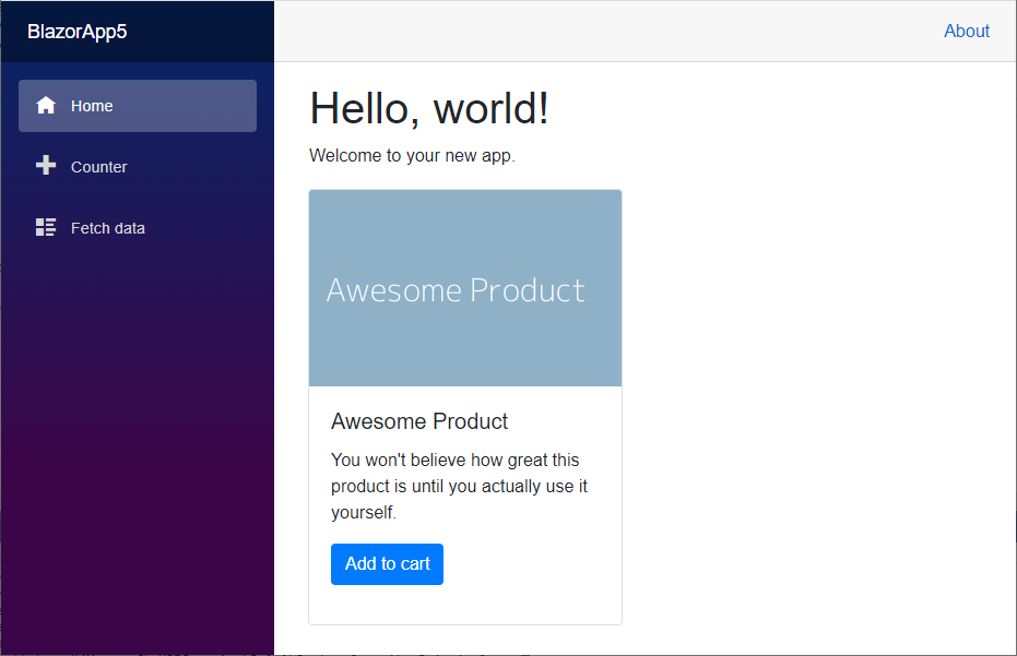
Your first Blazor Component in Action
Let’s take a look at our Component in action. We start the application and we immediately see our ProductCard component rendered on the index page of the application.
This is the foundation of a Blazor application. Sure, there are advanced topics, including Component parameters, Routing, sharing data between components, and much more.
But when it comes to creating Blazor components, you have learned all the required fundamentals to explore the world of Blazor components yourself.
What’s next?
Check out these other blog posts about Blazor:
If you’re interested in learning more about Blazor, you’ll definitely want to join my email list, where I talk a lot about Blazor, share information with the community, and offer answers to your questions.
If you want to dive deep into Blazor, you can also check out my upcoming Blazor – Creating Web Applications with C# online course. Everyone signing up before the launch of the course in April will be eligible for a massive discount.


I ran into an issue (might be a typo):
“The variables are part of the Blazor component class deriving from Microsoft.AspNetCore.Components.ComponentBase… [not System.AspNetCore.Components.BaseComponent]”.
If you extract the @code into a code-behind file (ProductCard.razor.cs), your class will need to inherit from this component class (as well as declaring the variables as “protected” so the razor markup can see them).
You are right, Jon. Thank you so much for your feedback. I corrected the mistake in the article.