
This video is part of The FREE Blazor Crash Course. In this crash course, we build an actual Blazor WebAssembly application based on .NET 5.
Table of Content
- The FREE Blazor Crash Course – Getting Started
- Blazor Form Component & Validation
- Blazor API Handling
- Blazor Modal Dialog Component (this article)
- Blazor CSS Handling
- Static Images
- Building a Dashboard
- End-to-End Testing using SpecFlow
In this video, we will implement a Blazor modal dialog component that we can use everywhere in our application. We learn how to use arguments in event callbacks, and we learn about the power of reusable components.
Let’s take a look at what we’re going to build.
Modal Dialog (Demo)
In the completed FinanceMentor application, we want to use modal dialogs to interact with the user. On the Earnings page, we have a list of all the entries on the left. In the last column, we have a delete button.
We don’t want to delete rows accidentally. That’s why we ask the user for confirmation when the delete button gets clicked.
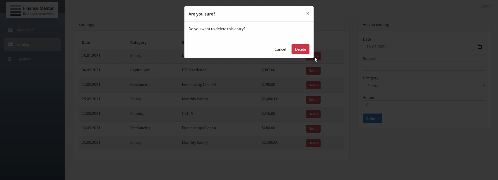
Demo App (Completed): Delete Dialog (Modal Dialog Component)
If we hit the cancel button in the modal dialog, nothing happens. On the other hand, if we confirm and press the delete button in the dialog, the application removes the row from the table.
That’s what we are going to build in this video. We will implement a modal dialog component and use it on the Earnings page of the FinanceMentor application.
Create the Modal Dialog Component
Let’s jump into Visual Studio and create the ModalDialog component. First of all, let’s create a new Razor component in the Components folder. We right-click the Components folder and add a new Razor Component.
In the new item dialog, we name the component ModalDialog. We press the add button, and Visual Studio closes the dialog and creates a new file.
First of all, I insert a code snippet with the template for the modal dialog.
<div class="modal fade show" id="myModal" style="display:block; background-color: rgba(10,10,10,.8);" aria-modal="true" role="dialog">
<div class="modal-dialog">
<div class="modal-content">
<div class="modal-header">
<h4 class="modal-title">This is the title</h4>
<button type="button" class="close">×</button>
</div>
<div class="modal-body">
<p>This is the message text.</p>
</div>
<div class="modal-footer">
<button type="button" class="btn btn-primary">OK</button>
</div>
</div>
</div>
</div>
As we did in the previous video of this series, we use Bootstrap to build the user interface. Bootstrap offers predefined CSS classes that we can use to create a modal dialog component.
Before we change the template and make it more dynamic, let’s use the ModalDialog component on the Earnings page.
On the Earnings page, we scroll down to the end of the template definition and add a reference to the ModalDialog component.
Let’s start the application and take a first look at our ModalDialog component in action.
Test the Simple ModalDialog Component
When we navigate to the Earnings page, the modal dialog appears on the screen. I would say it looks great. However, we cannot interact with the dialog yet.
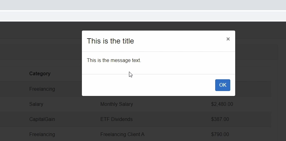
Blazor App: Static Modal Dialog
It doesn’t matter if we click the OK button or press the cross in the dialog’s top-right corner. Also, we see static text and a static title in the dialog.
Let’s head back to Visual Studio to make the component more dynamic and useful.
Implement Parameters
Back in Visual Studio, we open the ModalDialog component. First of all, let’s create properties to hold the title and the text of the dialog.
Again, we want to make those properties available when using the component in another component. Therefore, we add the Parameter attribute to the property definitions.
<div class="modal fade show" id="myModal" style="display:block; background-color: rgba(10,10,10,.8);" aria-modal="true" role="dialog">
<div class="modal-dialog">
<div class="modal-content">
<div class="modal-header">
<h4 class="modal-title">@Title</h4>
<button type="button" class="close">×</button>
</div>
<div class="modal-body">
<p>@Text</p>
</div>
<div class="modal-footer">
<button type="button" class="btn btn-primary">OK</button>
</div>
</div>
</div>
</div>
@code {
[Parameter]
public string Title { get; set; }
[Parameter]
public string Text { get; set; }
}
Next, we replace the static text with the variables we just created. Remember to use the @-symbol in front of the variable name.
Implement Behavior
Now that we have the basic properties set up let’s add some behavior to the component. We want to build a component that can be used in different places across the application. That’s why we cannot implement business-specific code in this component.
Instead, we let the caller of our component decide what to do based on how the user interacts with the ModalDialog component.
Let’s define another parameter for our ModalDialog component. This time, we use the EventCallback type again. But other than in the previous video, we also use the generic type argument and define the OnClose property as EventCallback of boolean.
[Parameter]
    public EventCallback<bool> OnClose { get; set; }
Next, let’s implement methods that we can bind to the template and execute the OnClose callback.
We start by implementing a private ModalCancel method. The implementation is simple. We use the OnClose callback and call its InvokeAsync method and provide false as its argument.
private Task ModalCancel()
{
    return OnClose.InvokeAsync(false);
}

private Task ModalOk()
{
    return OnClose.InvokeAsync(true);
}
Next, we implement a private ModalOk method. Again, we use the OnClose callback and call its InvokeAsync method. However, this time, we provide true as its argument.
Now let’s bind those methods to the template.
<div class="modal fade show" id="myModal" style="display:block; background-color: rgba(10,10,10,.8);" aria-modal="true" role="dialog">
<div class="modal-dialog">
<div class="modal-content">
<div class="modal-header">
<h4 class="modal-title">@Title</h4>
<button type="button" class="close" @onclick="@ModalCancel">×</button>
</div>
<div class="modal-body">
<p>@Text</p>
</div>
<div class="modal-footer">
<button type="button" class="btn btn-primary" @onclick=@ModalOk>OK</button>
</div>
</div>
</div>
</div>
For the close button on the top-right corner defined on line 6, we add the onclick-attribute and use the ModalCancel method. Again, make sure to use the @-symbol in front of the method name.
We do the same for the OK-button, except that we bind the ModalOk method instead.
Adjusting the Earnings page
Before we can test the component again, we need to adjust the code in the Earnings page where we use the component.
Let’s start by creating a bool property that we can use to decide if the Earnings page should show the modal dialog. We define a DeleteDialogOpen property of type bool.
public bool DeleteDialogOpen { get; set; }
Next, we change the template and use an if-statement to show the ModalDialog only when the DeleteDialogOpen property is true.
@if (DeleteDialogOpen)
{
    <ModalDialog Title="Are you sure?"
                 Text="Do you want to delete this entry?"
                 OnClose="@OnDeleteDialogClose">
    </ModalDialog>
}
Now, let’s add the missing arguments to the ModalDialog. We set the title and the text properties. For the OnClose-property, we define a reference to the OnDeleteDialogClose method we are going to implement next.
The OnClose-argument is not provided by IntelliSense. It turns out I forgot to add the Parameter-Attribute in the definition. Let’s head back to the ModalDialog component and fix that.
Back in the Earnings page, let’s implement the OnDeleteDialogClose method.
private async Task OnDeleteDialogClose(bool accepted)
    {
        DeleteDialogOpen = false;
        StateHasChanged();
    }
We define a private OnDeleteDialogClose method with a single argument of type bool. The argument contains the information on whether the user has confirmed or canceled the dialog. In this method, we set the DeleteDialogOpen property to false and call the StateHasChanged method.
Last but not least, we implement a private OpenDeleteDialog method returning void. In this method, we set the DeleteDialogOpen property to true.
private void OpenDeleteDialog()
{
    DeleteDialogOpen = true;
    StateHasChanged();
}
Now we need to use the OpenDeleteDialog method in the template. Let’s create another column in the table to hold the delete button. I prepared another snippet for the delete button itself.
<td><button type="button" class="btn btn-danger btn-sm" @onclick="() => OpenDeleteDialog(earning)">Delete</button></td>
Now that’s everything in place, let’s start the application again.
Test the Modal Component
Let’s navigate to the Earnings page once again. This time we see the new column with the delete button. When we click on the button, the modal dialog opens. If we click on the OK button or the cross in the top right corner, the modal dialog closes.
That’s exactly what we wanted to see and how we implemented it.
Implementing the API Handling
Now that the ModalDialog component works as expected let’s freshen up what we learned in the previous video and implement API handling to remove the entry from the data store.
First of all, open the EarningsController class. I insert a snippet for the Delete method.
[HttpDelete("{id?}")]
public void Delete(Guid id)
{
  var entity = _earningRepository.GetAll()
    .Single(item => item.Id == id);
  _earningRepository.Remove(entity);
}
Again, this course focuses on Blazor web development and not on ASP.NET WebAPI. Nonetheless, we create a method that handles the HttpDelete request and identifies an item using its id.
Back in the Earnings page component, let’s define a private field of type Earning that will contain the item that we want to remove. We call it earningToDelete.
private Earning _earningToDelete;
Next, let’s change the signature of the OpenDeleteDialog method and add an argument of type Earning to it. Within the method, we set the earning instance we get as a method argument to the earningToDelete field.
private void OpenDeleteDialog(Earning earning)
    {
        _earningToDelete = earning;
        DeleteDialogOpen = true;
    }
We now need to fix the template where we call the OpenDeleteDialog method and provide the earning item as an argument to the method.
<td><button type="button" class="btn btn-danger btn-sm" @onclick="() => OpenDeleteDialog(earning)">Delete</button></td>
As the last step, we actually need to call the API and remove the item from the storage. In the OnDeleteDialogClose method, we use the HttpClient to delete the item. After we removed the item, we want to reload the data and set the earningToDelete field to null.
private async Task OnDeleteDialogClose(bool accepted)
    {
        if (accepted)
        {
            await Http.DeleteAsync($"api/Earnings/{_earningToDelete.Id}");
            await LoadData();
            _earningToDelete = null;
        }
        DeleteDialogOpen = false;
    }
Remember, we only want to remove the item when a user accepts the modal dialog. To implement that, we move our code in an if-statement. If the user cancels the dialog, we still want to set the DeleteDialogOpen property to false. That’s why we leave this statement out of the if-block.
Let’s run and test the application again.
Test the Application
Once again, we open the Earnings page and click on the first item’s delete button in the list. When I click on the cross, nothing happens. I click on the delete button again, but this time, I press the OK button, the item gets removed from the table.
But we can do even better. Let’s improve the ModalDialog component to make it even more flexible to use.
Implementing Different Dialog Types
We are missing a cancel button, and depending on the scenario, we might want to have different buttons in our modal dialogs.
Therefore, we add a ModalDialogType to our ModalDialog component.
public enum ModalDialogType
    {
        Ok,
        OkCancel,
        DeleteCancel
    }
In the ModalDialog component, we create a public enum ModalDialogType with the values Ok, OkCancel, and DeleteCancel.
Next, we create a property of this type for the component and mark it with the Parameter-attribute.
[Parameter]
public ModalDialogType DialogType { get; set; }
Now it’s time to change the template. Instead of always showing the OK-button, we use a switch-statement to render the buttons depending on the DialogType.
@switch (DialogType)
{
    case ModalDialogType.Ok:
        <button type="button" class="btn btn-primary" @onclick=@ModalOk>OK</button>
        break;
    case ModalDialogType.OkCancel:
        <button type="button" class="btn" @onclick="@ModalCancel">Cancel</button>
        <button type="button" class="btn btn-primary" @onclick=@ModalOk>OK</button>
        break;
    case ModalDialogType.DeleteCancel:
        <button type="button" class="btn" @onclick="@ModalCancel">Cancel</button>
        <button type="button" class="btn btn-danger" @onclick=@ModalOk>Delete</button>
        break;
}
For the Ok-type, we render the Ok button like we already had before. For the OkCancel-type, we also render a Cancel button in addition to the OK-button. And for the DeleteCancel-type we render a button of type danger and change the label to Delete.
Last but not least, let’s head back to the Earnings page.
In the Earnings page, we add the DialogType argument to the ModalDialog component reference and provide the DeleteCancel option.
<ModalDialog Title="Are you sure?"
                 Text="Do you want to delete this entry?"
                 OnClose="@OnDeleteDialogClose"
                 DialogType="ModalDialog.ModalDialogType.DeleteCancel">
</ModalDialog>
Let’s start the application again.
Testing the DialogType
As you can see, when I click on the delete button, we now have a modal dialog with two buttons, including a red delete button on the right.
Congratulations, you successfully implemented a very flexible modal dialog component that we can share across our application and use whenever we want to interact with the user.
Summary
This video is the fourth part of the FREE Blazor Crash Course.
- You learned how to implement a reusable modal dialog component.
- You learned how to render a component conditionally.
- We learned how to bind a click-handler method to the component template.
- We learned how to use the generic type argument of the EventCallback type to provide data to its caller.
What’s next?
In the next video of this series, we will take a look at how to use and handle CSS in Blazor applications to style your components.
Tell me in the comments what you like about Blazor and what you want me to explain next.
ModalDialog Component Source Code (Completed)
For reference, here is the source code of the completed Blazor ModalDialog component:
<div class="modal fade show" id="myModal" style="display:block; background-color: rgba(10,10,10,.8);" aria-modal="true" role="dialog">
<div class="modal-dialog">
<div class="modal-content">
<div class="modal-header">
<h4 class="modal-title">@Title</h4>
<button type="button" class="close" @onclick="@ModalCancel">×</button>
</div>
<div class="modal-body">
<p>@Text</p>
</div>
<div class="modal-footer">
@switch (DialogType)
{
case ModalDialogType.Ok:
<button type="button" class="btn btn-primary" @onclick=@ModalOk>OK</button>
break;
case ModalDialogType.OkCancel:
<button type="button" class="btn" @onclick="@ModalCancel">Cancel</button>
<button type="button" class="btn btn-primary" @onclick=@ModalOk>OK</button>
break;
case ModalDialogType.DeleteCancel:
<button type="button" class="btn" @onclick="@ModalCancel">Cancel</button>
<button type="button" class="btn btn-danger" @onclick=@ModalOk>Delete</button>
break;
}
</div>
</div>
</div>
</div>
@code {
[Parameter]
public string Title { get; set; }
[Parameter]
public string Text { get; set; }
[Parameter]
public EventCallback<bool> OnClose { get; set; }
[Parameter]
public ModalDialogType DialogType { get; set; }
private Task ModalCancel()
{
return OnClose.InvokeAsync(false);
}
private Task ModalOk()
{
return OnClose.InvokeAsync(true);
}
public enum ModalDialogType
{
Ok,
OkCancel,
DeleteCancel
}
}